Hello Neighbor: Hide & Seek Review
Dynamic Pixel’s newest entry into the Hello Neighbor series, Hide & Seek, follows in the footsteps of its predecessor, by being a perfect example of a great concept, but poor execution. Sloppy controls paired with questionable level and character design lead to an overall frustrating and forgettable experience.

In an attempt to provide more context and backstory to the premise of the series’ original entry, Hello Neighbor: Hide & Seek sets itself as a prequel, and follows the events that occurred prior to the base game. The player fills the role of Mya Peterson, daughter of series antagonist Mr. Peterson, who along with her brother Aaron Peterson look to expand their imaginations by playing hide & seek. Within these play sessions, the two imagine grand and scenic environments to which their game takes place. Players are tasked with solving puzzles and completing all collection-based objectives to win each game, all while Aaron sneaks around the map trying to catch you. When the player gets caught, Aaron will remove some of the collectibles that you have collected, forcing the player to retrace their steps and backtrack.
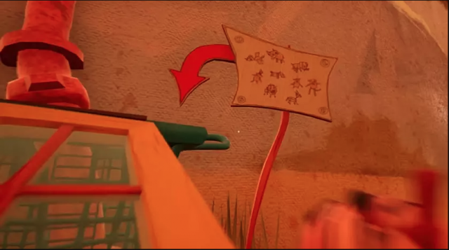
Within the four or five hours it took me to complete the game, I found myself constantly feeling lost and looking for direction to complete even the smallest of tasks. While the game attempts to direct players throughout its six stages by using environmental hints, many clues are quite vague and imprecise. Many a time I found myself aimlessly circling the admittedly small stage map trying to figure out just what exactly I was supposed to do besides dodge Aaron. Normally, when a game uses this approach, it is also paired with either a tutorial or small explanation as to how the premise of the game works. Yet, Hide & Seek never makes mention to even the simplest of gameplay aspects. No literal dialogue (outside of the repetitive and irritating gibberish Aaron will speak), no tutorial stage, not even an explanation of the game's controls are present (albeit, they can be found in the settings menu); nothing is told to the player prior to stepping into the first stage.

While the gameplay formula can be quite frustrating at times, the pair of extremely poor level & A.I. design along with slippery controls truly take the cake. Portions of the game require the player to traverse and scale large set pieces such as mountains or over-sized furniture in order to retrieve one of the aforementioned collectibles. When attempting to do so in a conventional fashion, such as using a ladder or lift, more often than not I would find no such way to do so. Instead, the game forces you to ascend in a 'trial by error' manner, smashing the spacebar in hopes of clipping onto a solid in-game asset to propel you higher. If you have ever played an Elder Scrolls games, such as Oblivion or Skyrim, imagine how you would try to climb a mountain in the most straightforward fashion. That is the default method of scaling most objects in this game.
What will elevates frustrations even greater is the feeling as if your character is wearing ice skates at all times. Numerous times I found myself spending half an hour just trying to maneuver Mya ever so perfectly to land on the certain spot I was supposed to move to. Rounding back to the issue of poor level design and environmental hints, many of the assets that players will interact with do not appear as though they are meant to be interacted with. For example, in one of the stages centered around Mya imagining herself as a firefighter, the player must successfully jump onto an extremely narrow and thin leg of an oversized chair to begin a series of jumps leading to their first collectible. While just landing successfully on the chair is unfortunately an achievement, the chair itself appears to just be a decorative portion of the environment. While having various ways to tackle objectives is an aspect to gameplay, sometimes providing a more linear path to completing a task will breed better results in the end.
Between all of this, there is an attempt at a story that should be harrowing and touching, but left me unamused and disinterested. As someone who played the original Hello Neighbor, I truly was interested in gaining a greater understand and insight into Mr. Peterson's backstory and hopefully find out what drove him down his dark and twisted path. Upon finishing the game and having the credits begin to roll, I was left wanting more and feeling quite let down. Normally, if a game has a strong narrative but blemishes within its gameplay, I will usually stick it out (E.g. Shadow of the Colossus); yet, Hide & Seek truly pushed my limits with this. On a multitude of occasions I found myself wanting to skip cutscenes (which is quite abnormal for this reviewer), just so I wouldn't waste more time than is needed to complete the game. Personally, out of all of the shortcomings within Hide & Seek, this may be my biggest disappointment with the game. In a time when narrative-driven experiences in gaming have never been stronger, it's disappointing to see the wasted potential of not only Hide & Seek, but the Hello Neighbor series in general.

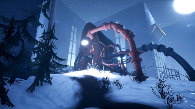
While the game does stumble for the majority of its playtime, credit needs to be given to the art team at Dynamic Pixels as the game is visually stunning and very aesthetically pleasing. The cartoonish art style is the biggest success to take away from the prequel. Blending well with the beautiful lighting within the game, it portrays the whimsical emotions that many found as kids when playing in a "make-believe" fashion. Outside of the gameplay downfalls, Hide & Seek runs remarkably well. Reviewed on an above average gaming PC (with a GTX 1060 6 GB GPU), the title runs impeccably smooth on Ultra settings at 1080p resolution, pushing well over 60 frames per second. Hardware specification for those who do find an interest in the title shouldn't be a concern.
As a fan of the stealth horror genre, I truly wanted Hide & Seek to hook me. Yet, with its myriad of gameplay issues and narrative shortcomings, it's one that didn’t hook me in the least bit. Dynamic Pixels have laid the groundwork for a great series in Hello Neighbor, and Hide & Seek should've been a welcomed addition to its backstory, but unfortunately the mark has been missed by quite a bit. The series is still quite young, only officially being released a year ago, with more content on the way, but if Hide & Seek is any indication of the direction the series is taking, its lifespan may have an approaching expiration date.
Hello Neighbor: Hide and Seek (Reviewed on Windows)
The game is average, with an even mix of positives and negatives.
Sloppy controls, an aimless direction, and atrocious level design hinders Dynamic Pixel's newest entry in the Hello Neighbor series from reaching the potential that many believe it has. While a whimsical art style and great performance across a variety of hardware are great to see, Hide & Seek results in a forgettable and frustrating experience overall.


COMMENTS
samihamo - 02:19pm, 15th February 2020
احب هذه العبه
--1586681787 - 09:57am, 12th April 2020
112@jsjfhbfffj
Miawaug - 08:05am, 21st May 2020
Hello neighbor hide and seek
Kerim - 08:26pm, 1st December 2020
kero2222
Vjesnalaw@gmail.com - 01:46pm, 3rd October 2023
Hnkolaj