Card Quest Preview
[EDITOR'S NOTE: This was written back in March]
Some of my fondest memories are tied in some way or another to cards; Yu Gi Oh, Pokémon, solitaire, birthdays, banks - if there were cards involved, I was all over it. When I laid my eyes on Card Quest, I knew I needed to play it, and I expected it to be terrible.
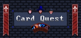
I still haven’t learnt never to judge a book by it’s cover, you see; the user interface for this one looks like it could have jumped straight from Microsoft Paint, and the concept of using cards instead of actions to take down enemies simply sounded far too familiar initially for me to appreciate the game’s underlying complexity. The player starts by ignoring the tutorial and choosing which of three well-trodden archetypes they usually do when faced with a suit of armour, a wand or a dagger. Gameplay involves two phases, the attack and the defense: in order to come out victorious, the player will need to carefully balance resources and their card count, while taking into account how each unique enemy operates when it comes to their turn.

Simple, I hear you cry? You’d be dead wrong. Once it gets into the swing of things, Card Quest becomes an intricate dance of forethought and fortune that leaves the player feeling absurdly satisfied upon clearing a room on their first turn. Each one of those three characters has innumerable items, upgrades and other unlockable goodies to be discovered through besting a level, meaning that you can often build your characters in ways that feel right to you. I only really started appreciating the mage’s gameplay when I unlocked the fire spells, because fire is the only way. Similarly, I experimented a great deal with the rogue’s gameplay, and still can’t decide whether I prefer the “hold back and look for an opportunity” approach or the “attack even when it isn’t your go” one.
Now back to those tutorials, because they are important - there’s a general one for basic gameplay which you can probably skip over (doing is the greatest lesson, after all), and one for each character. I found these specialised tutorials to be some of the most challenging obstacles Card Quest had to throw at me. Rather than mere battles, these are well planned out puzzles designed to test your understanding of the gameplay, of each individual card, of enemy movements, and even of your ability to think ahead. Reach the end and you’ll be awarded with a unique item for that character which will certainly come in handy if you’re struggling to finish the first zone. Plus, what decent card shark doesn’t appreciate a challenging trial of wit?

Once I actually started playing, I realised that my first impression of the artwork was dramatically misinformed. Yes, it’s another pixel-art job, but there’s a surprising amount of detail in enemy and card design that just draws you in. Foes like the ‘festering horror’ and the ever lovely ‘crawler’ are utterly diabolical, and I love it. Often times, I’ve found that when I’m rushing through those first areas again, I fall into an almost trancelike state where the cards fly faster than throwing knives, and although the screen shows a series of square blood spatters, my mind’s eye generates this magnificent waltz of weaves and blows, of daggers in the back and of blades whistling through rancid tissue. Of course, as the difficulty ramps up, I am reduced to tactical thinking and panic-selecting cards in a desperate gambit to stay alive. It almost inspires in its simplicity, and I find it difficult to imagine that I’m the only one affected so profoundly by this one.
Being an Early-Access title, it still feels as though Card Quest has a little way to go. Random NPC encounters, for example, are a mechanic that I would really like to see more variety in, and having more options to choose from for each character at the start may very well have made that first half hour a touch more compelling. As it stands, the game is in a good form; it’s functional, feels right in the hand and really doesn’t look as bad as I first thought. This one’s a gem that I would recommend you keep an eye on as it nears completion.


COMMENTS